
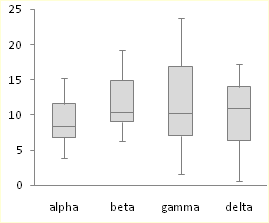
If you’re doing statistical analysis, you may want to create a standard box plot to show distribution of a set of data. In a box plot, numerical data is divided into quartiles, and a box is drawn between the first and third quartiles, with an additional line drawn along the second quartile to mark the median. In some box plots, the minimums and maximums outside the first and third quartiles are depicted with lines, which are often called whiskers.

While Excel 2013 doesn’t have a chart template for box plot, you can create box plots by doing the following steps:
-
Calculate quartile values from the source data set.
-
Calculate quartile differences.
-
Create a stacked column chart type from the quartile ranges.
-
Convert the stacked column chart to the box plot style.
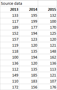
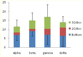
In our example, the source data set contains three columns. Each column has 30 entries from the following ranges:
-
Column 1 (2013): 100–200
-
Column 2 (2014): 120–200
-
Column 3 (2015): 100–180
In this article
-
Step 1: Calculate the quartile values
-
Step 2: Calculate quartile differences
-
Step 3: Create a stacked column chart
-
Step 4: Convert the stacked column chart to the box plot style
-
Hide the bottom data series
-
Create whiskers for the box plot
-
Color the middle areas
-
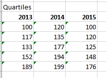
Step 1: Calculate the quartile values
First you need to calculate the minimum, maximum and median values, as well as the first and third quartiles, from the data set.
-
To do this, create a second table, and populate it with the following formulas:
Value
Formula
Minimum value
MIN(cell range)
First quartile
QUARTILE.INC(cell range, 1)
Median value
QUARTILE.INC(cell range, 2)
Third quartile
QUARTILE.INC(cell range, 3)
Maximum value
MAX(cell range)
-
As a result, you should get a table containing the correct values. The following quartiles are calculated from the example data set:

Top of Page
Step 2: Calculate quartile differences
Next, calculate the differences between each phase. In effect, you have to calculate the differentials between the following:
-
First quartile and minimum value
-
Median and first quartile
-
Third quartile and median
-
Maximum value and third quartile
-
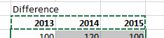
To begin, create a third table, and copy the minimum values from the last table there directly.
-
Calculate the quartile differences with the Excel subtraction formula (cell1 – cell2), and populate the third table with the differentials.
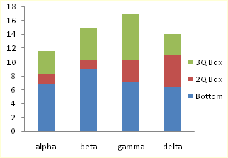
For the example data set, the third table looks like the following:
Top of Page
Step 3: Create a stacked column chart
The data in the third table is well suited for a box plot, and we’ll start by creating a stacked column chart which we’ll then modify.
-
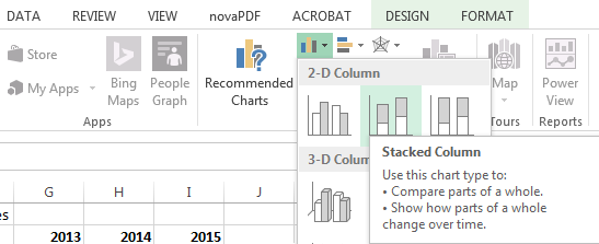
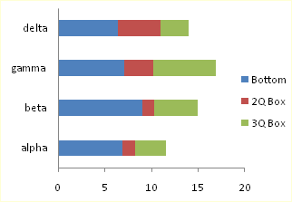
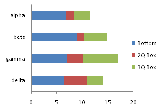
Select all the data from the third table, and click Insert > Insert Column Chart > Stacked Column.
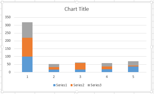
At first, the chart doesn’t yet resemble a box plot, as Excel draws stacked columns by default from horizontal and not vertical data sets.
-
To reverse the chart axes, right-click on the chart, and click Select Data.
-
Click Switch Row/Column.
Tips:
-
To rename your columns, on the Horizontal (Category) axis labels side, click Edit, select the cell range in your third table with the category names you want, and click OK.
-
To rename your legend entries, on the Legend Entries (Series) side, click Edit, and type in the entry you want.
-
-
Click OK.
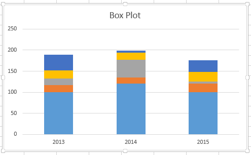
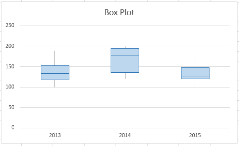
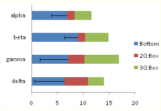
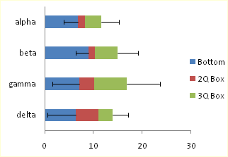
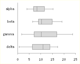
The graph should now look like the one below. In this example, the chart title has also been edited, and the legend is hidden at this point.
Top of Page
Step 4: Convert the stacked column chart to the box plot style
Hide the bottom data series
To convert the stacked column graph to a box plot, start by hiding the bottom data series:
-
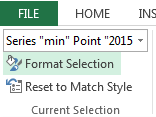
Select the bottom part of the columns.
Note: When you click on a single column, all instances of the same series are selected.
-
Click Format > Current Selection > Format Selection. The Format panel opens on the right.
-
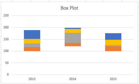
On the Fill tab, in the Formal panel, select No Fill.
The bottom data series are hidden from sight in the chart.
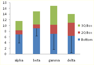
Create whiskers for the box plot
The next step is to replace the topmost and second-from-bottom (the deep blue and orange areas in the image) data series with lines, or whiskers.
-
Select the topmost data series.
-
On the Fill tab, in the Formal panel, select No Fill.
-
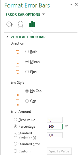
From the ribbon, click Design > Add Chart Element > Error Bars > Standard Deviation.
-
Click one of the drawn error bars.
-
Open the Error Bar Options tab, in the Format panel, and set the following:
-
Set Direction to Minus.
-
Set End Style to No Cap.
-
For Error Amount, set Percentage to 100.
-
-
Repeat the previous steps for the second-from-bottom data series.
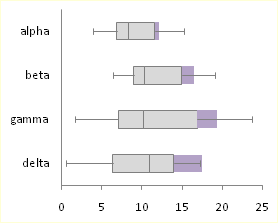
The stacked column chart should now start to resemble a box plot.

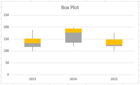
Color the middle areas
Box plots are usually drawn in one fill color, with a slight outline border. The following steps describe how to finish the layout.
-
Select the top area of your box plot.
-
On the Fill & Line tab in Format panel click Solid fill.
-
Select a fill color.
-
Click Solid line on the same tab.
-
Select an outline color and a stroke Width.
-
Set the same values for other areas of your box plot.
The end result should look like a box plot.
Top of Page
See Also
Available chart types in Office
Charts and other visualizations in Power View
Excel 2016, как известно, обогатился новыми типами диаграмм. Одна такая, которая диаграмма Парето, уже была показана. В этот раз рассмотрим другую, чисто статистическую. Называется «ящик с усами» или «коробчатая диаграмма» (box-and-whiskers plot или boxplot).
Раньше я такие видел только в специализированных ПО, типа STATISTICA, и для того, чтобы нарисовать подобную диаграмму в Excel, нужно было изрядно потрудиться. Теперь она есть в стандартном наборе Excel.

Зачем нужна такая диаграмма? Допустим, есть выборка для анализа. А еще лучше несколько выборок, которые нужно сравнить. Для этого рассчитывают различные показатели. Однако к любому расчету всегда хочется добавить наглядности, чтобы мозг перешел в режим образного представления, а не довольствовался сухими цифрами и формулами. Поэтому основные характеристики ловко изображают на рисунке. Отличным вариантом будет как раз диаграмма «ящик с усами».

На рисунке показан формат по умолчанию. Как видно, сравниваются две выборки путем изображения двух «ящиков с усами».
Что здесь что обозначает?
Крестик посередине – это среднее арифметическое по выборке.
Линия чуть выше или ниже крестика – медиана.
Нижняя и верхняя грань прямоугольника (типа ящика) соответствует первому и третьему квартилю (значениям, отделяющим ¼ и ¾ выборки). Расстояние между 1-м и 3-м квартилем – это межквартильный размах (или расстояние).
Горизонтальные черточки на конце «усов» – максимальное и минимальное значение (без учета выбросов, см. ниже).
Отдельные точки – это выбросы, которые показываются по умолчанию. Если значение выходит за пределы 1,5 межквартильных размаха от ближайшего квартиля, то оно считается аномальным. Их можно скрыть (см. ниже настройки).
Во всей красе «ящик с усами» проявляется при сравнении выборок, в которых данные делятся на категории. Допустим, провели некоторый эксперимент среди мужчин и женщин. Есть данные до и после эксперимента по обоим полам. Для анализа потребуется вычислить различные показатели. А если к этому добавить диаграмму «ящик с усами», то результат будет весьма наглядным.

Отлично видно, что после проведения эксперимента данные по мужчинам в целом уменьшились, а данные среди женщин наоборот, увеличились. Это не значит, что выборки больше не нужно анализировать (сравнивать, проверять гипотезы и т.д.). Но наглядность сильно улучшает понимание. Перейдем к настройкам.
Настройки диаграммы «ящик с усами»
Общий вид диаграммы настраивается стандартно. Можно менять цвет, добавлять подписи и т.д. Для этого есть две контекстные вкладки на ленте (Конструктор и Формат). Но есть настройки, предназначенные специально для этой диаграммы.
Выбираем какой-либо ряд и жмем Ctrl+1. Либо два раза кликаем по какому-нибудь «ящику». Можно через правую кнопку Формат ряда данных…. Справа вылазит панель настроек.

Рассмотрим по порядку.
Боковой зазор – регулирует ширину ящиков и расстояние между ними.
Показывать внутренние точки. Если поставить галочку, то на оси, где расположены «усы», точками будут показаны все значения. Так хорошо видно распределение внутри групп.

Показывать точки выбросов – отражать экстремальные значения.

Выбросы – это точки, выходящие за пределы 1,5 межквартильных размаха.
Показать средние метки – среднее арифметическое (крестики). Стоят по умолчанию, но можно скрыть.
Показать среднюю линию – только для различных категорий. Показывает изменения по категориям.

Если добавить линии, то изменения после эксперимента станут видны еще лучше. В справке написано, что соединяются медианы, но на графике почему-то соединяются средние. Чудеса.
Инклюзивная медиана или эксклюзивная медиана. Инклюзивная медиана включает в «ящик» квартильные значения , а эксклюзивная медиана не включает. При выборе «эксклюзивной медианы» верх и низ «ящика» соответствует средней между квартильным и следующим (от центра) значением. По умолчанию стоит «эксклюзивная». Пусть стоит дальше. Причем тут медиана, вообще не понял, – речь ведь про квартиль. Думал, криво перевели, но в английской версии те же названия. В общем, здесь лучше ничего не менять.
Своевременное использование диаграммы «ящик-усы» может дать весьма ценную и наглядную информацию. Аналитику, который использует специализированные программы или трудоемкие настройки Excel, будет очень приятно иметь такую диаграмму под рукой.
Как показано в ролике ниже, все делается очень быстро и просто.
Поделиться в социальных сетях:
Диаграмма со смешным названием “Ящик с усами” используется в Excel, как правило, для проведения статистического анализа. Когда имеется массив данных для нескольких тестовых групп за различные периоды, и необходимо понять, как изменился разброс показателей — не обойтись без этой диаграммы.
Конечно, если вывести все эти показатели в таблицу — то какой-то результат тоже можно увидеть. Но визуализации в виде диаграмм всегда воспринимаются лучше, чем просто цифры (тем более, что не все руководители дружат с цифрами).
Еще несколько лет назад для построения диаграммы “Ящик с усами” нужно было пользоваться специализированным софтом (или как минимум Python) или очень сильно колдовать в excel. Но начиная с версии Excel- 2016, данный вид диаграммы входит в стандартный пакет.
В этой статье мы рассмотрим два варианта построения диаграммы Ящик с усами: простой — для счастливых обладателей Excel от 2016-й версии и моложе, и сложный — “танцы с бубном” для тех, кому с версией Excel повезло меньше.
Содержание статьи:
- Из чего состоит диаграмма Ящик с усами
- Диаграмма Ящик с усами встроенным инструментом Excel (для версий от 2016 и новее)
- Диаграмма Ящик с усами при помощи гистограммы с накоплением (для версий Excel до 2016 г)
Из чего состоит диаграмма
Смысл диаграммы Ящик с усами в том, чтобы показать основные характеристики статистической выборки данных: распределение данных между квартилями, среднее значение, медиану, максимальное и минимальное значения, а также выбросы данных.
Думаю, понятно, что ящик — это прямоугольник с заливкой, а усы — это черточки над и под прямоугольником.
Ящик — это межквартильный размах (или расстояние) — отделяет ¼ и ¾ выборки данных. Если ящик, условно говоря, большой — больше другого ящика — это означает, что выборка относительно однородна, и большая часть данных сконцентрирована вокруг медианы.
Черточки усов — это максимальное и минимальное значение (без учета выбросов).
Ус снизу — это разница между минимумом и 1-м квартилем.
Ус сверху — это разница между 3-м квартилем и максимумом.
Крестик посередине — среднее арифметическое значение по выборке.
Черта посередине ящика — медиана по выборке.
Выбросы — значения, сильно отклоняющиеся от основного массива выборки (выходит за пределы 1,5 межквартильных размаха от ближайшего квартиля).
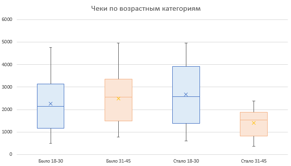
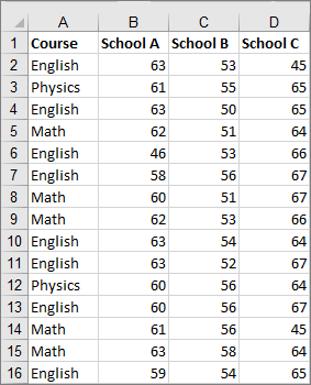
Чтобы стало еще понятнее, рассмотрим построение диаграммы Ящик с усами на примере в excel. В нашем примере есть две возрастных группы покупателей: от 18 до 30 лет и от 30 до 45 лет. По ним имеем данные о суммах в чеках, на которые они совершали покупки.
Позже была проведена маркетинговая акция, и нужно понять, что изменилось в распределении сумм покупок в каждой группе.
Диаграмма Ящик с усами встроенным инструментом Excel (для версий от 2016 и новее)
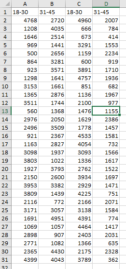
Часть выборки данных выглядит следующим образом:
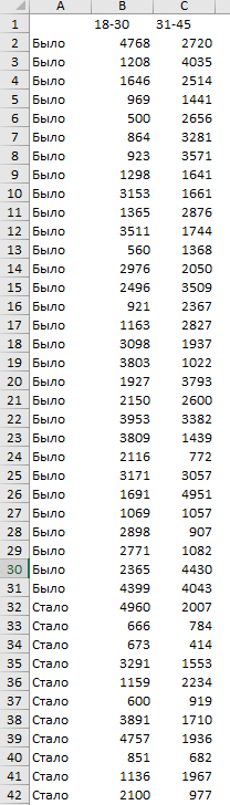
В левом столбце показатель периода (было до акции — стало после акции). Вверху названия групп (18-30, 31-45), и в ячейках суммы, на которые совершались покупки.
Внимание: таблица не должна содержать никаких итогов!
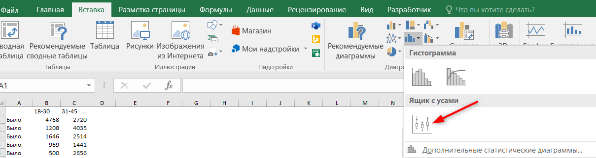
Все, что нужно сделать — это выделить массив данных вместе с названием периода и заголовками столбцов и далее: вкладка Вставка — блок Диаграммы — кнопка Гистограммы — выбрать Ящик с усами.
Переименовываем диаграмму и наслаждаемся результатом.
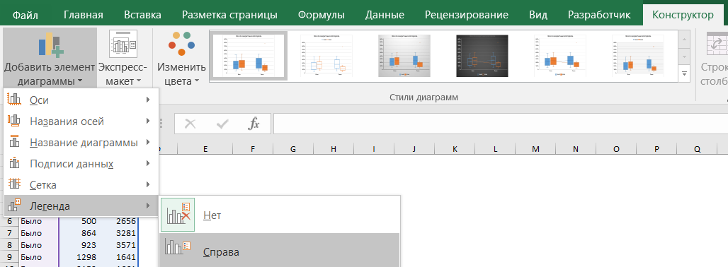
Произведем некоторые настройки.
Во-первых, выведем легенду, чтобы было понятно, где какая группа.
Во-вторых, добавим среднюю линию, показывающую тренд между периодами. Среднюю линию можно добавить, если есть не менее двух рядов данных.
Правой кнопкой мыши щелкнем на “ящике”, и выберем Формат ряда данных, установим “галку” Средняя линия.
Здесь же можно регулировать отображение точек выбросов на диаграмме.
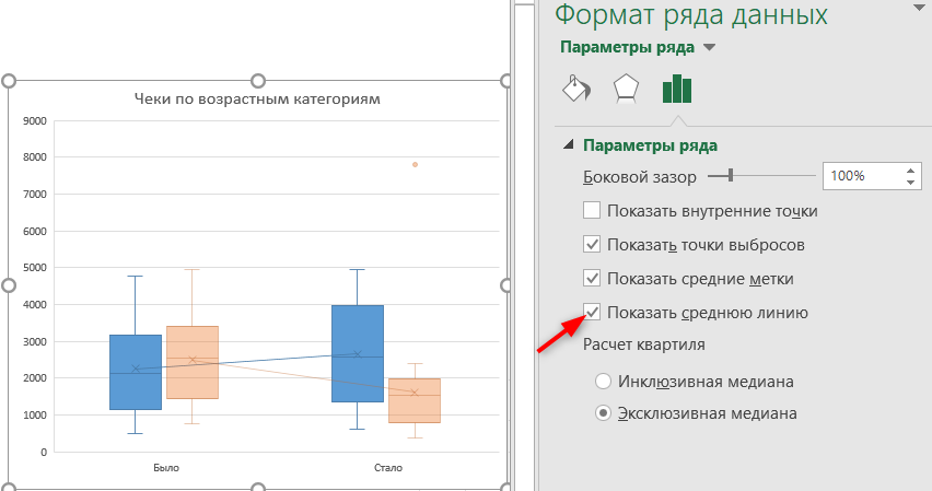
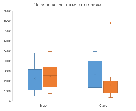
Диаграмма готова.
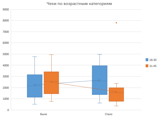
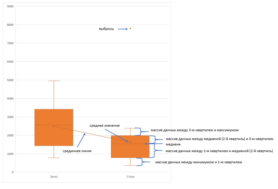
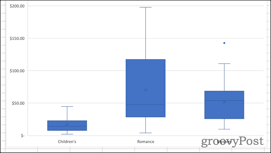
Что можно понять из диаграммы Ящик с усами, которую мы сейчас построили:
- В группе 18-30 лет средний чек немного вырос. Смотрим на крестик, который отображает среднее значение, и на среднюю линию, которая идет слегка вверх.
- В группе 31-45 лет средний чек, наоборот, прилично упал. Это говорит о том, что формат акции не попал в эту целевую аудиторию.
- Медианная сумма, на которую чаще всего совершали покупки (линия посередине ящика) также немного выросла для группы 18-30, и упала для группы 31-45, что также говорит о неудачной акции для второй группы.
- Размер ящика для группы 18-30 увеличился, также и низ, и верх ящика заняли более высокие позиции. Снова “за” успешность акции для этой категории покупателей, они стали совершать более разнообразные покупки, и в целом тратить больше денег.
- А группа 31-45, напротив, стала тратить меньше денег (низ и верх ящика снизили позиции на графике), и размер ящика также уменьшился, как и размер усов. Т.е.покупки стали более фиксированными (возможно, остались самые постоянные покупатели с фик
- Присутствует также один выброс для группы 31-45 — точка на уровне 7800. Это чек, сумма которого сильно отклоняется от основной массы покупок.
Диаграмма Ящик с усами в excel при помощи гистограммы с накоплением (для версий Excel до 2016 г)
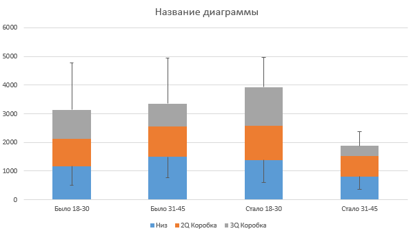
Работать будем с той же выборкой данных, только переформатируем ее так, чтобы для каждого ящика был отдельный столбец.
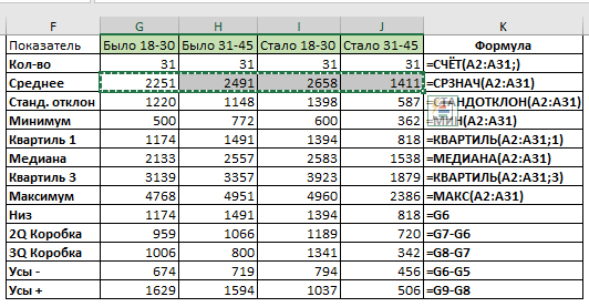
Создадим дополнительную таблицу, в которой пропишем определенные формулы. Форму таблицы и формулы смотрите на картинке:
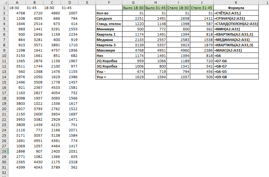
Выделим заголовки и строки Низ, 2Q Коробка и 3Q Коробка (как на картинке).
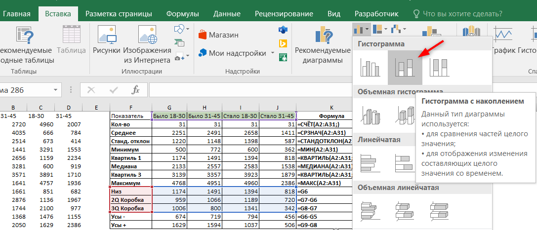
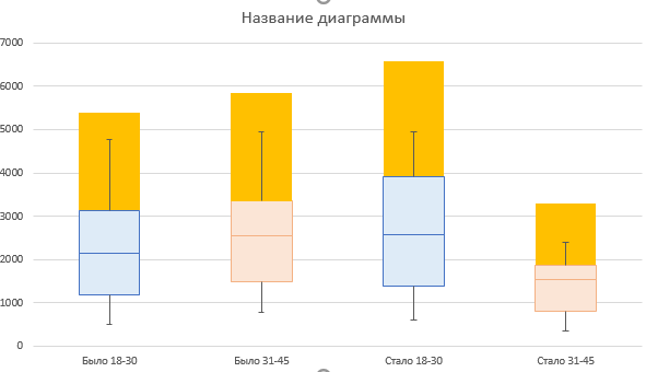
Перейдем во вкладку Вставка — Гистограмма — Гистограмма с накоплением.

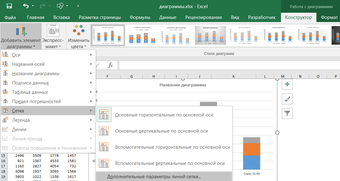
Теперь нужно нарисовать усы, начнем с нижних. Выделим на диаграмме ряд Низ, и перейдем на вкладку Конструктор — Макеты диаграмм — Добавить элементы диаграмм — Предел погрешностей — Дополнительные параметры погрешностей.
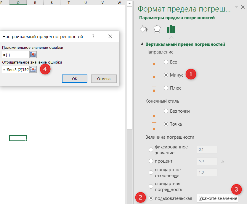
В окне Формат предела погрешностей нужно установить параметры в следующем порядке:
- Вертикальный предел погрешностей — Направление — Минус
- Величина погрешности — Пользовательская
- Нажать кнопку Укажите значение
- Поле Положительное значение ошибки оставить без изменений. Поле Отрицательное значение ошибки активировать и выделить значения из таблицы, соответствующие строке “Усы -” (только цифры).
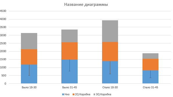
Должны появиться вот такие черточки.
Теперь похожим образом нужно нарисовать верхние усы. Для этого выделим ряд 3Q Коробка, и снова перейдем на вкладку Конструктор — Макеты диаграмм — Добавить элементы диаграмм — Предел погрешностей — Дополнительные параметры погрешностей.
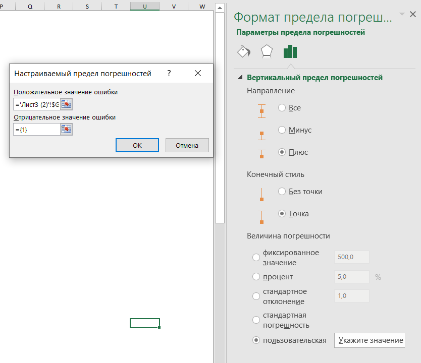
Здесь нужно указать направление вертикального предела погрешностей Плюс, величина погрешности Пользовательская, нажать кнопку Укажите значения. В поле Положительное значение установить курсор и выделить значения из строки “Усы +”. Поле Отрицательное значение ошибки оставить без изменений.
Должны появиться верхние усы.
Осталось немного доработать внешний вид диаграммы.
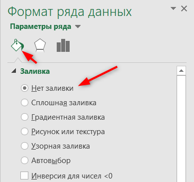
Уберем заливку с ряда Низ (синий в примере). Для этого выделим его, щелкнем правой кнопкой мыши — Формат ряда данных — и в блоке Заливка укажем Нет заливки.
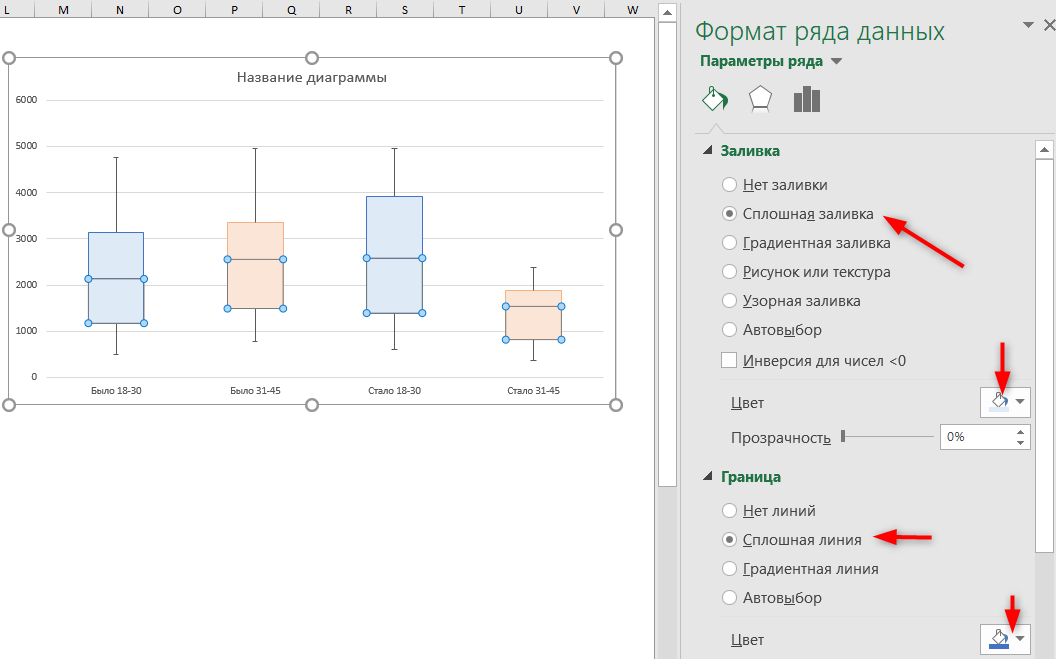
Не выходя из окна Формат ряда данных, изменим цвет для ящиков.
Осталось добавить среднее значение (крестик).
Для этого выделим строку Среднее (только числа) и нажмем Ctrl + С.
Теперь выделим диаграмму и нажмем Ctrl + V. Должно получиться что-то похожее на картинку:
Правой кнопкой мыши щелкаем на новом ряде данных и выбираем Изменить тип диаграммы для ряда.
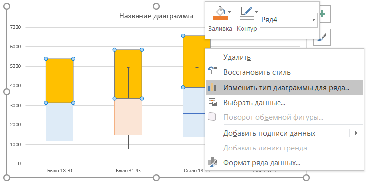
И для нового ряда выбираем тип диаграммы Точечная.
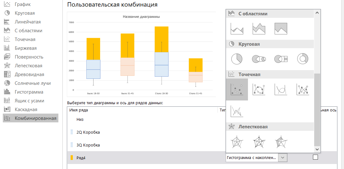
Обязательно снимите “галку” Вспомогательная ось”, если она установилась.
Осталось изменить точку на крестик (по желанию). Дважды щелкаем на любой точке, и в открывшемся окне Формат ряда данных выбираем: Маркер — Встроенный — крестик в выпадающем списке.
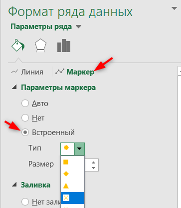
Диаграмма готова.
Конечно, у нее есть несколько недостатков по сравнению со встроенным инструментом:
- из диаграммы намеренно убраны точки выбросов, поскольку они существенно исказили бы результат. Точки выбросов можно нарисовать отдельно аналогично тому, как мы создавали крестики для среднего значения. Или не использовать их совсем.
- Нет средней линии между блоками одного ряда. При желании и сильно заморочившись, их можно нарисовать при помощи графиков. Возможно, в этой статье будет продолжение, как это сделать.
- Ряды данных не разделены визуально. Где ряд Было и Стало, видно только из названия.
Но в целом, если нет возможности установить более новую версию Excel, то это неплохой обходной путь создать диаграмму Ящик с усами в Excel.
Вам может быть интересно:
Tuesday, June 7, 2011
Peltier Technical Services, Inc., Copyright © 2023, All rights reserved.
Box and Whisker Charts (Box Plots) are commonly used in the display of statistical analyses. In 2016 Microsoft Excel added a box and whisker chart, but it is not very flexible, and some of the expected formatting options for charts are not available. But you can create your own fully-features Box and Whisker charts, using stacked bar or column charts and error bars. This tutorial shows how to make box plots, in vertical or horizontal orientations, in all modern versions of Excel.
In its simplest form, the box and whisker diagram has a box showing the range from first to third quartiles, and the median divides this large box, the “interquartile range”, into two boxes, for the second and third quartiles. The whiskers span the first quartile, from the second quartile box down to the minimum, and the fourth quartile, from the third quartile box up to the maximum.
These techniques for creating box plots are complicated, and they can get long and boring, and this resulting tedium can lead to errors. Peltier Tech Charts for Excel creates waterfall charts and many other charts not built into Excel, at the push of a button.
Sample Data and Calculations
To play along at home in Excel 2007 or 2010, download the workbook Excel_2007_Box_Plot_Workbook.xlsx.
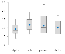
Let’s use the following simple data set for our tutorial. The values were taken from a normally distributed population with a mean of 10 and standard deviation of 5. There are four sets of 20 values.
All of these values are positive. If your data set has mixed positive and negative values, this technique requires major modifications.
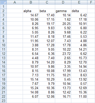
First, insert a bunch of blank rows, and set up a range for calculations. Only the horizontal version of the box plot uses the last calculated row, “Offset”. It will not hurt to include it in the vertical box plot’s calculations.
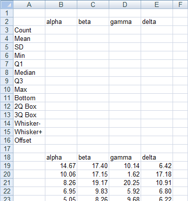
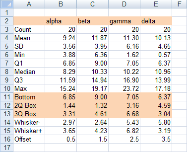
First, compute some simple statistics, such as the count, mean, and standard deviation. The formulas used in column B are shown in column G of the screen shot.

Now let’s compute the minimum and maximum, median, and first and third quartiles.

Finally, let’s determine which values we need to plot. Our chart has a box for the second quartile, which shows the difference between median and first quartile calculated above. It has a box for third quartile, which show the difference between the third quartile calculation and the median. The bottom of the lower box rests on the first calculated quartile. The down whisker is as long as the first quartile minus the minimum, and the up whisker is as long as the maximum minus the third quartile.
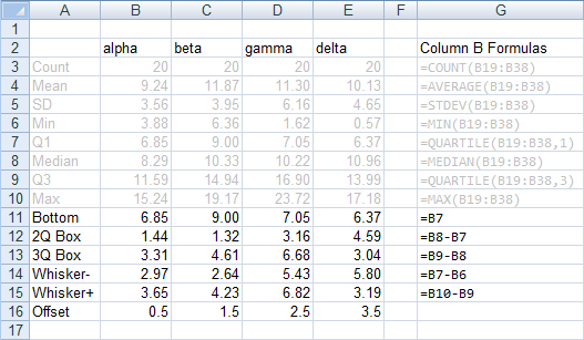
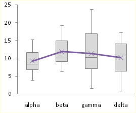
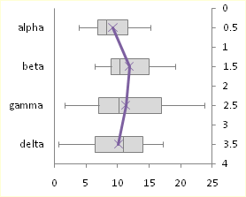
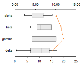
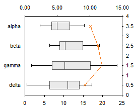
The offset values are calculated as follows: In my example, I have four categories, Alpha through Delta. I can divide my horizontal chart into four horizontal strips, numbered from 0 to 4, each containing one box-and-whisker unit. I need to position my average points in the middle of each 1-unit horizontal strip. These will ultimately go onto a secondary vertical axis which I will have conveniently scaled from 0 to 4. Hence the Y values I will need are 0.5, 1.5, 2.5, and 3.5.
Chart Construction
Select the header row of the calculated data, then hold Ctrl while selecting the three rows that include Bottom, 2Q Box, and 3Q Box. This multiple-area range is highlighted in orange below.
With this range selected, insert a stacked column chart or a stacked bar chart. Be sure to use the stacked version, and not the 100% stacked version, of the column or bar chart.
The labels in the bar chart go bottom-to-top. To reverse the labels, select the vertical axis, press Ctrl-1 (numeral one) to open the Format Axis dialog, then check the “Categories in Reverse Order” box, then under “Horizontal Axis Crosses”, select “At maximum category”.
To add the down whisker, select the Bottom series, then in the Chart Tools > Layout tab, click Error Bars, and select More Error Bar Options from the bottom of the menu. Choose the Minus direction, select Custom for Error Amount, and click on Specify Value. Leave the contents of the Positive Error Value box alone (“={1}”) in the mini dialog that appears, then clear the Negative Error Value box and select the Whisker- row from the table (B14:E14). Click OK and Close to get back to Excel. These “down” error bars (whiskers) extend from the bottom (left) edge of the 2Q Box downward (leftward) into the Bottom series.
To add the up whisker, select the 3Q Box series,then in the Chart Tools > Layout tab, click Error Bars, and select More Error Bar Options from the bottom of the menu. Choose the Plus direction, select Custom for Error Amount, and click on Specify Value. Leave the contents of the Negative Error Value box alone (“={1}”) in the mini dialog that appears, then clear the Positive Error Value box and select the Whisker+ row from the table (B15:E15). Click OK and Close to get back to Excel.
These “up” error bars (whiskers) extend upward (rightward) from the top (right) of the 3Q Box.
Now we can format the boxes. Select the Bottom series, and apply no fill and no border, so it is hidden. Then select each of the 2Q Box and 3Q Box series, and apply a dark border and a light fill.
Adding the Mean
To add the mean as a series of markers, select the Mean row in the calculated range (highlighted in blue). If you are making a horizontal box plot, hold Ctrl and also select the Offset row (highlighted in green), so both areas are selected. Copy the selected range.

Select the chart, and use Paste Special to add the data as a new series. If you are making a horizontal box and whisker diagram, check the “Category (X Labels) in First Row” box. The “Series Names in First Column” box should already be checked.
The new series is added as another column or bar stacked on top of the existing ones.

Select this new series, then on the Chart Tools > Design tab, click on Change Chart Type. If you are making a vertical box plot, choose a Line Chart style. If you are making a horizontal box plot, choose an XY Scatter style.

The points in the horizontal box plot are in reverse order. To change the order of points, select the secondary vertical axis (right edge of the chart), press Ctrl-1 (numeral one) to open the Format Axis dialog, then check the “Values in Reverse Order” box.
If you’re making a horizontal box plot in Excel 2003, this last process is a little more involved. Excel draws both secondary axes, but the vertical one is hidden behind the primary axis with the text labels (below left). Double click on the secondary horizontal axis (top of chart), and on the scale tab of the Format Axis dialog, check “Value (Y) Axis Crosses at Maximum Value” (below right).
Excel 2003, continued: Double click the secondary vertical axis (right of chart), and on the scale tab, check “Values in Reverse Order” and uncheck “Value (X) Axis Crosses at Maximum Value” (below left). Finally, select the secondary horizontal axis (top) and click Delete; Excel will now plot the XY series on the primary horizontal axis.

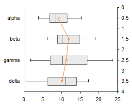
All Versions: Now format the mean series: remove the line, and use an appropriate marker of a contrasting color. If you’ve made a horizontal box plot, hide the secondary Y axis (right edge of the chart) by choosing no tick marks, no tick labels, and no line in the Format Axis dialog.
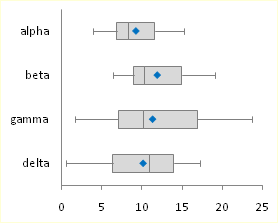
That was easy and didn’t take too long.
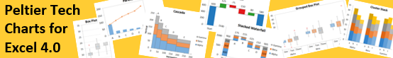
Box and Whisker Charts in Peltier Tech Charts for Excel

This tutorial shows how to create Box and Whisker Charts (Box Plots), including the specialized data layout needed, and the detailed combination of chart series and chart types required. This manual process takes time, is prone to error, and becomes tedious.
I have created Peltier Tech Charts for Excel to create Box Plots (and many other custom charts) automatically from raw data. This utility, a standard Excel add-in, lays out data in the required layout, then constructs a chart with the right combination of chart types.
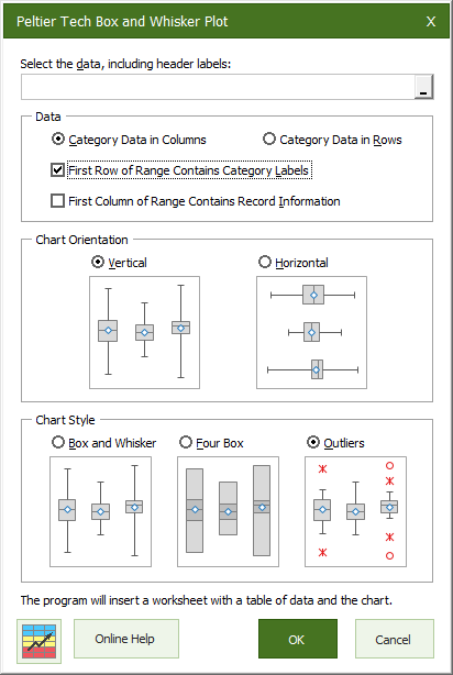
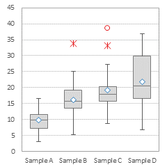
The utility creates vertical Box Plots …
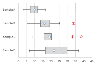
… horizontal Box Plots …
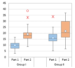
… and Grouped Box Plots …
Outliers can be shown or hidden, and a number of quartile definition options are available.
This is a commercial product, tested on thousands of machines in a wide variety of configurations, Windows and Mac, which saves time and aggravation.
Please visit the Peltier Tech Charts for Excel page for more information.
Содержание
- Диаграмма «ящик с усами» (boxplot) в Excel 2016
- Настройки диаграммы «ящик с усами»
- Create a box and whisker chart
- Create a box and whisker chart
- Change box and whisker chart options
- Create a box and whisker chart
- Change box and whisker chart options
- How to Make a Box Plot in Excel
- What Is a Box Plot?
- How to Make a Box Plot in Excel for Microsoft 365
- Formatting a Box Chart in Excel
- A Welcome Addition for Statistical Analysis
Диаграмма «ящик с усами» (boxplot) в Excel 2016
Excel 2016, как известно, обогатился новыми типами диаграмм. Одна такая, которая диаграмма Парето, уже была показана. В этот раз рассмотрим другую, чисто статистическую. Называется «ящик с усами» или «коробчатая диаграмма» (box-and-whiskers plot или boxplot).
Раньше я такие видел только в специализированных ПО, типа STATISTICA, и для того, чтобы нарисовать подобную диаграмму в Excel, нужно было изрядно потрудиться. Теперь она есть в стандартном наборе Excel.

Зачем нужна такая диаграмма? Допустим, есть выборка для анализа. А еще лучше несколько выборок, которые нужно сравнить. Для этого рассчитывают различные показатели. Однако к любому расчету всегда хочется добавить наглядности, чтобы мозг перешел в режим образного представления, а не довольствовался сухими цифрами и формулами. Поэтому основные характеристики ловко изображают на рисунке. Отличным вариантом будет как раз диаграмма «ящик с усами».

На рисунке показан формат по умолчанию. Как видно, сравниваются две выборки путем изображения двух «ящиков с усами».
Что здесь что обозначает?
Крестик посередине – это среднее арифметическое по выборке.
Линия чуть выше или ниже крестика – медиана.
Нижняя и верхняя грань прямоугольника (типа ящика) соответствует первому и третьему квартилю (значениям, отделяющим ¼ и ¾ выборки). Расстояние между 1-м и 3-м квартилем – это межквартильный размах (или расстояние).
Горизонтальные черточки на конце «усов» – максимальное и минимальное значение (без учета выбросов, см. ниже).
Отдельные точки – это выбросы, которые показываются по умолчанию. Если значение выходит за пределы 1,5 межквартильных размаха от ближайшего квартиля, то оно считается аномальным. Их можно скрыть (см. ниже настройки).
Во всей красе «ящик с усами» проявляется при сравнении выборок, в которых данные делятся на категории. Допустим, провели некоторый эксперимент среди мужчин и женщин. Есть данные до и после эксперимента по обоим полам. Для анализа потребуется вычислить различные показатели. А если к этому добавить диаграмму «ящик с усами», то результат будет весьма наглядным.

Отлично видно, что после проведения эксперимента данные по мужчинам в целом уменьшились, а данные среди женщин наоборот, увеличились. Это не значит, что выборки больше не нужно анализировать (сравнивать, проверять гипотезы и т.д.). Но наглядность сильно улучшает понимание. Перейдем к настройкам.
Настройки диаграммы «ящик с усами»
Общий вид диаграммы настраивается стандартно. Можно менять цвет, добавлять подписи и т.д. Для этого есть две контекстные вкладки на ленте (Конструктор и Формат). Но есть настройки, предназначенные специально для этой диаграммы.
Выбираем какой-либо ряд и жмем Ctrl+1. Либо два раза кликаем по какому-нибудь «ящику». Можно через правую кнопку Формат ряда данных…. Справа вылазит панель настроек.

Рассмотрим по порядку.
Боковой зазор – регулирует ширину ящиков и расстояние между ними.
Показывать внутренние точки. Если поставить галочку, то на оси, где расположены «усы», точками будут показаны все значения. Так хорошо видно распределение внутри групп.

Показывать точки выбросов – отражать экстремальные значения.
Выбросы – это точки, выходящие за пределы 1,5 межквартильных размаха.
Показать средние метки – среднее арифметическое (крестики). Стоят по умолчанию, но можно скрыть.
Показать среднюю линию – только для различных категорий. Показывает изменения по категориям.

Если добавить линии, то изменения после эксперимента станут видны еще лучше. В справке написано, что соединяются медианы, но на графике почему-то соединяются средние. Чудеса.
Инклюзивная медиана или эксклюзивная медиана. Инклюзивная медиана включает в «ящик» квартильные значения , а эксклюзивная медиана не включает. При выборе «эксклюзивной медианы» верх и низ «ящика» соответствует средней между квартильным и следующим (от центра) значением. По умолчанию стоит «эксклюзивная». Пусть стоит дальше. Причем тут медиана, вообще не понял, – речь ведь про квартиль. Думал, криво перевели, но в английской версии те же названия. В общем, здесь лучше ничего не менять.
Своевременное использование диаграммы «ящик-усы» может дать весьма ценную и наглядную информацию. Аналитику, который использует специализированные программы или трудоемкие настройки Excel, будет очень приятно иметь такую диаграмму под рукой.
Как показано в ролике ниже, все делается очень быстро и просто.
Источник
Create a box and whisker chart
A box and whisker chart shows distribution of data into quartiles, highlighting the mean and outliers. The boxes may have lines extending vertically called “whiskers”. These lines indicate variability outside the upper and lower quartiles, and any point outside those lines or whiskers is considered an outlier.
Box and whisker charts are most commonly used in statistical analysis. For example, you could use a box and whisker chart to compare medical trial results or teachers’ test scores.

Create a box and whisker chart
Select your data—either a single data series, or multiple data series.
(The data shown in the following illustration is a portion of the data used to create the sample chart shown above.)
In Excel, click Insert > Insert Statistic Chart > Box and Whisker as shown in the following illustration.
Important: In Word, Outlook, and PowerPoint, this step works a little differently:
On the Insert tab, in the Illustrations group, click Chart.
In the Insert Chart dialog box, on the All Charts tab, click Box & Whisker.

Use the Design and Format tabs to customize the look of your chart.

If you don’t see these tabs, click anywhere in the box and whisker chart to add the Chart Tools to the ribbon.
Change box and whisker chart options
Right-click one of the boxes on the chart to select that box and then, on the shortcut menu, click Format Data Series.
In the Format Data Series pane, with Series Options selected, make the changes that you want.
(The information in the chart following the illustration can help you make your choices.)
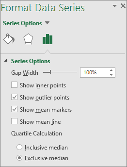
Controls the gap between the categories.
Show inner points
Displays the data points that lie between the lower whisker line and the upper whisker line.
Show outlier points
Displays the outlier points that lie either below the lower whisker line or above the upper whisker line.
Show mean markers
Displays the mean marker of the selected series.
Displays the line connecting the means of the boxes in the selected series.
Choose a method for median calculation:
Inclusive median The median is included in the calculation if N (the number of values in the data) is odd.
Exclusive median The median is excluded from the calculation if N (the number of values in the data) is odd.
Tip: To read more about the box and whisker chart and how it helps you visualize statistical data, see this blog post on the histogram, Pareto, and box and whisker chart by the Excel team. You may also be interested learning more about the other new chart types described in this blog post.
Create a box and whisker chart
Select your data—either a single data series, or multiple data series.
(The data shown in the following illustration is a portion of the data used to create the sample chart shown above.)
On the ribbon, click the Insert tab, and then click  (the Statistical chart icon), and select Box and Whisker.
Use the Chart Design and Format tabs to customize the look of your chart.
If you don’t see the Chart Design and Format tabs, click anywhere in the box and whisker chart to add them to the ribbon.
Change box and whisker chart options
Click one of the boxes on the chart to select that box and then in the ribbon click Format.
Use the tools in the Format ribbon tab to make the changes that you want.
Источник
How to Make a Box Plot in Excel


If you’re presenting or analyzing difficult statistical data, you might need to know how to make a box plot in Excel. Here’s what you’ll need to do.
Microsoft Excel allows you to create informative and attractive charts and graphs to help present or analyze your data. You can easily create bar and pie charts from your data, but creating a box plot in Excel has always been more challenging for users to master.
The software didn’t provide a template specifically for creating box plots, but it’s much easier now. If you want to make a box plot in Excel, here’s what you’ll need to know (and do).
What Is a Box Plot?
For descriptive statistics, a box plot is one of the best ways to demonstrate how data is distributed. It shows the numbers in quartiles, highlighting the mean value as well as the outliers. Statistical analysis uses box plot charts for everything from comparing medical trial results to contrasting different teachers’ test scores.
The basis for a box plot is to display data based on a five-number summary. This means showing:
- Minimum value: the lowest data point in the data set, excluding any outliers.
- Maximum value: the highest data point in the data set, excluding outliers.
- Median: the middle value in the data set
- First, or Lower, quartile: this is the median of the lower half of the values in the data set.
- Third, or Upper, quartile: the median of the upper half of the data set’s values
Sometimes, a box plot chart will have lines extending vertically up or down, showing how the data might vary outside the upper and lower quartiles. These are called “whiskers,” and the charts themselves are sometimes referred to as box and whisker charts.
How to Make a Box Plot in Excel for Microsoft 365
In past versions of Excel, there wasn’t a chart template specific to box plots. While it was still possible to create it, it took a lot of work. Office 365 does include box plots as an option now, but it’s somewhat buried in the Insert tab.
The instructions and screenshots below assume Excel for Microsoft 365. The steps below have been created using a Mac, but we also provide instructions where the steps are different on Windows.
First, of course, you need your data. Once you’ve finished entering it, you can create and stylize your box plot.
To create a box plot in Excel:
- Select your data in your Excel workbook—either a single or multiple data series.
- On the ribbon bar, click the Insert tab.
- On Windows, click Insert > Insert Statistic Chart > Box and Whisker.
- On macOS, click the Statistical Chart icon, then select Box and Whisker.
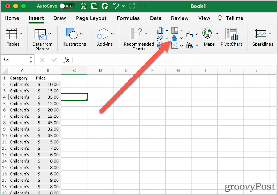
That will net you a very basic box plot, with whiskers. Next, you can modify its options to look how you want.
Formatting a Box Chart in Excel
Once you’ve created your box plot, it’s time to pretty it up. The first thing you should do is give the chart a descriptive title. To do this, click the existing title, then you can select the text and change it.
From the Design and Format tabs of the ribbon, you can modify how Excel styles your box chart. This is where you can select the theme styles used, change the fill color of the boxes, apply WordArt styles, and more. These options are universal to just about all of the charts and graphs you might create in Excel.
If you want to change options specific to the box and whisper chart, click Format Pane. Here, you can change how the chart represents your data. For example:
A Welcome Addition for Statistical Analysis
It wasn’t always so easy to figure out how to create a box plot in Excel. Creating the chart in previous versions of the spreadsheet software required manually calculating the different quartiles. You could then create a bar graph to approximate the presentation of a box plot. Microsoft’s addition of this chart type with Office 365 and Microsoft 365 is very welcome.
Of course, there are lots of other Excel tips and tricks you can learn if you’re new to Excel. Box plots might seem advanced, but once you understand the concepts (and the steps), they’re easy to create and analyze using the steps above.
Источник